
This blog post will guide you through making the barcode reader (qr code reader) button into an image, to make it more appealing on the eye for your customers and expand the possibilities with your Canvas App design without losing functionality or having to force an onclick event of a button.
Gathering the Assets
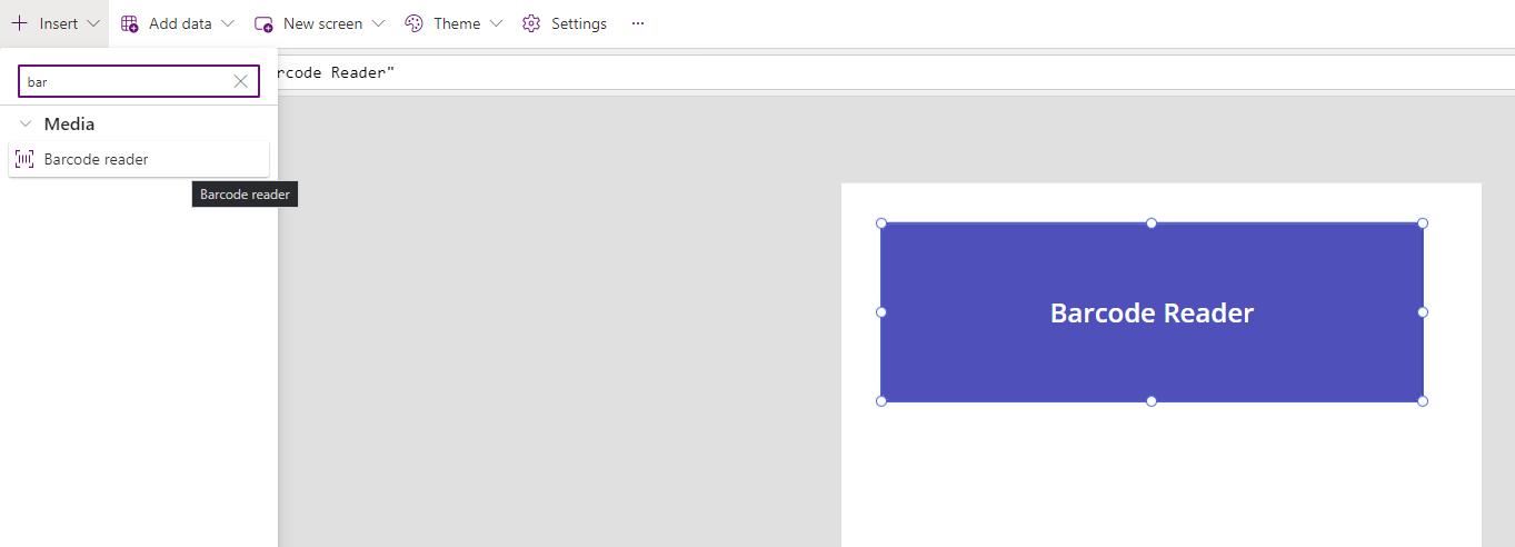
Firstly we’re going to start off by adding a barcode reader button:
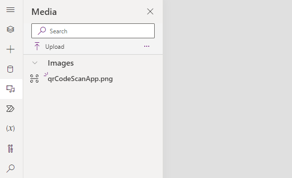
Secondly we’re going to add the image and text we want to use as our new barcode scanner button. You can do this by uploading the image to the media section and double-clicking on it for an image to be added to the app and then simply add the text.
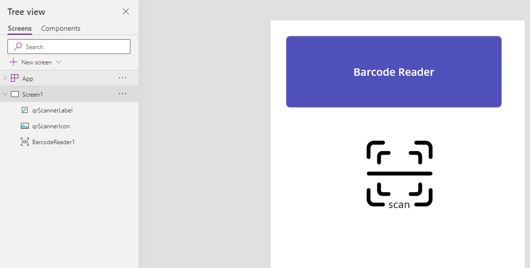
In my example I’m going to be using the barcode scanner as a QR code scanner, so I’ve added a QR code scanner icon image and some text that says ‘scan’:
Creating the Button
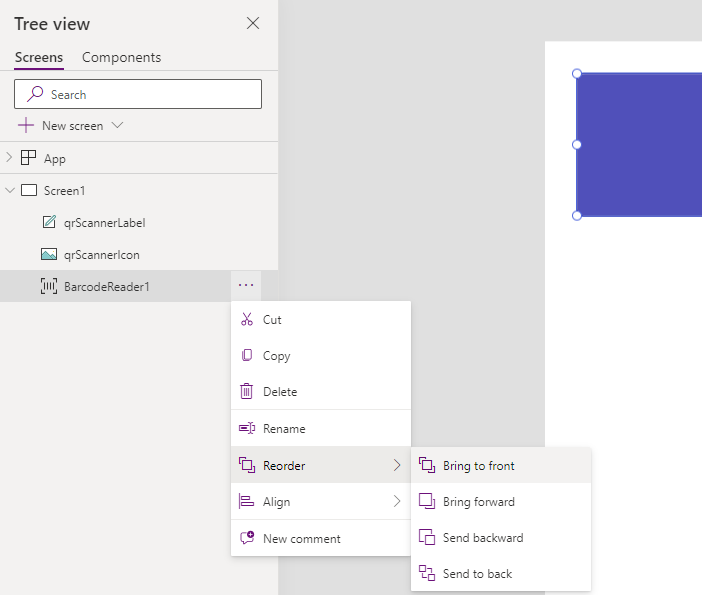
Now we want to overlay the button over the image and text, so ensure your barcode reader button is at the front of your layer ordering. To do this select the barcode scanner in the tree view, select the three dots, select reorder and click ‘bring to front’:
Once you have done this we need to drag our button over the image and text, the button is going to be the ‘hit’ area (the area where the user can press to launch the barcode reader) so ensure it covers the image and text with plenty of room:

We now have our template for our barcode/qr code scanner, we just need to make the image visible and remove the default text. Therefore, we firstly need to click the button and delete any text (Barcode Reader in the example image above).

We now can simply remove the button border and background color, to allow us to have a button that works, but technically can’t be seen. We do this by setting all of the text, background and border colors to transparent on all states (disabled, pressed, hover and default):
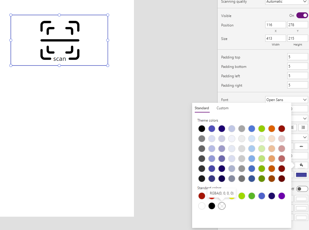
Once you have done this, your button will work like normal, but appear to the user as if they were clicking the image, allowing you to have the full control of the barcode reader button, with a little more styling than traditionally comes out of the box with the button!
The last thing you want to do is group the image, text and button together so you can easily move and adjust the size together (I’ve left the border in the image to show the transparent button which you can also remove or leave to show the hit-box area if you prefer):

