This Blog and Video post will explain how to get started with making Adaptive Cards for Microsoft Teams. We will look at the overview of the designer, create an example card and discuss the limitations.
Where to start
The best place to start when looking to create an Adaptive Card is the designer website. You can find the web address here: https://adaptivecards.io/designer/. When the website is open, you will see an example card that contains several elements. This will give you a good look and feel to what an Adaptive Card is, if you have not used these before. There’s a video that shows you a step-by-step method for this or alternatively there is a text based walkthrough below:
Video
If you’re a visual learner or just prefer videos, then check out the video of this below:
Walkthrough
We are going to click the ‘New Card’ button located at the top left, this will show you additional examples. From here, we will select the ‘Blank card’ option. This will leave us with an empty Adaptive Card for us to work with, as shown below:

Now we can begin our design. For this example, we will be creating an informational card that displays a title, text input field, and submit button. Firstly, before we move forward, we need to change the Target Version to 1.2 as Teams only uses this version. The target version is located on the top right of the screen.
Title Element
Let’s begin by putting a TextBlock onto the blank Adaptive Card, you can simply click and drag this from the left menu. Congratulations, you have added your first element to your card! The important thing to note at this point is the code, which we can see at the bottom of the screen in the Card Payload Editor. This code is the JSON representation of your card, which you will use when sending the Adaptive Card anywhere.
The section of the code we want to focus on is:
{
    "type": "TextBlock",
    "text": "New TextBlock",
    "wrap": true
}
This is the new TextBlock we have added, the type represents the type of the element. The text represents the string we are displaying. The wrap allows us to make lines drop down if the text is larger than the card. You can also see an elements properties to the right of the screen if it is selected. An important property to highlight at this point is the ID. The ID allows you to track and return data to Power Automate, so make sure you give elements an ID.

We can now set the text, either in the payload editor or the element properties to our title. I’m going to set the title to be ‘Adaptive Card Example’. We can also change the font, size, weight (boldness) and color.

Input Elements
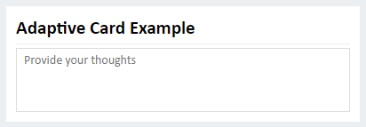
Now we’re moving on to adding an input element. Drag and drop the Input.Text element onto our card, under our title. We want to then select the element and change the placeholder text. We are going to enter ‘Provide your thoughts’ as an example. As this will be a multiple line text area, we need to select the Multi-Line option in the properties area. We also want to ensure that this is separate from the title, so select the Separator property. Again, we want to ensure that we have an ID set.
Your card should now look like this:

Your code should now look like this:
{
    "type": "AdaptiveCard",
    "$schema": "http://adaptivecards.io/schemas/adaptive-card.json",
    "version": "1.2",
    "body": [
        {
            "type": "TextBlock",
            "text": "Adaptive Card Example",
            "wrap": true,
            "size": "large",
            "weight": "bolder",
            "id": "title"
        },
        {
            "type": "Input.Text",
            "placeholder": "Provide your thoughts",
            "separator": true,
            "isMultiline": true,
            "id": "thoughts"
        }
    ]
}
Action Elements
The action element, a submit button, comes from the ActionSet element. Let’s drag the ActionSet element under our Input.Text element. This element is slightly different because we will be adding an action to the set. You can have multiple actions in an ActionSet but for this example we will be using one.
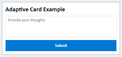
Now, in the properties section of the ActionSet, click Add an Action and select Action.Submit. This will display a button with Action.Submit, click that button to select the element. We will change the title to just ‘Submit’ and also change the style to ‘Positive’.

Your code should now look like this:
{
    "type": "AdaptiveCard",
    "$schema": "http://adaptivecards.io/schemas/adaptive-card.json",
    "version": "1.2",
    "body": [
        {
            "type": "TextBlock",
            "text": "Adaptive Card Example",
            "wrap": true,
            "size": "large",
            "weight": "bolder",
            "id": "title"
        },
        {
            "type": "Input.Text",
            "placeholder": "Provide your thoughts",
            "separator": true,
            "isMultiline": true,
            "id": "thoughts"
        },
        {
            "type": "ActionSet",
            "separator": true,
            "actions": [
                {
                    "type": "Action.Submit",
                    "title": "Submit",
                    "style": "positive",
                    "id": "submit"
                }
            ]
        }
    ]
}
Teams Features
What if you want to have work with the Teams style? Change the ‘Select Host App’ to Microsoft Teams – Light (or Dark) and you will have a Teams style applied to the visual representation of the card.
For our example, we have used a relatively small Adaptive Card. Now, if we want to ensure that we use the full width of Teams, we need to add some JSON. Let’s focus on the code outside of the body:
{
    "type": "AdaptiveCard",
    "$schema": "http://adaptivecards.io/schemas/adaptive-card.json",
    "version": "1.2",
    "body": [
        <IGNORE>
    ]
}
Under the version, we want to add an ‘msTeams’ parameter. Within that, we want to add a ‘width’ parameter of ‘full’ see below for a focused example:
"msTeams": {
    "width": "full"
}
This will maximize your Adaptive Card to use the full possible Teams width. You can check out the full code example below:
{
    "type": "AdaptiveCard",
    "$schema": "http://adaptivecards.io/schemas/adaptive-card.json",
    "version": "1.2",
    "msTeams": {
        "width": "full"
    },
    "body": [
        {
            "type": "TextBlock",
            "text": "Adaptive Card Example",
            "wrap": true,
            "size": "large",
            "weight": "bolder",
            "id": "title"
        },
        {
            "type": "Input.Text",
            "placeholder": "Provide your thoughts",
            "separator": true,
            "isMultiline": true,
            "id": "thoughts"
        },
        {
            "type": "ActionSet",
            "separator": true,
            "actions": [
                {
                    "type": "Action.Submit",
                    "title": "Submit",
                    "style": "positive",
                    "id": "submit"
                }
            ]
        }
    ]
}
Teams Visual
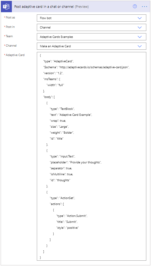
An example of a Power Automate Flow action posting this is shown below:

This is what it will look like in Teams:

As the posting of an Adaptive Card is a complex topic itself, this will be a separate post. Stay tuned, I’ll add the link here soon!
